SheReal Foods

  • Branding

SheReal Foods: Natural peanut butter with a loyal following, repackaged to finally stand out on the shelf.

SheReal prides itself on using natural and sustainable ingredients and has received positive feedback for the taste and quality of its peanut butter.
Client
SheReal Foods
Location
Philippines
Year
2024
Industry
F&B
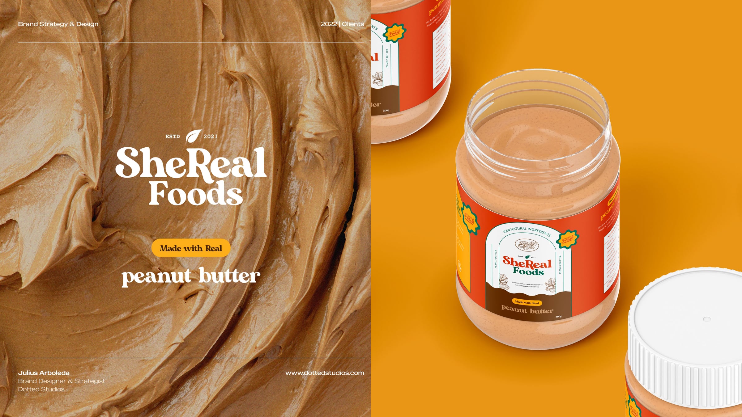
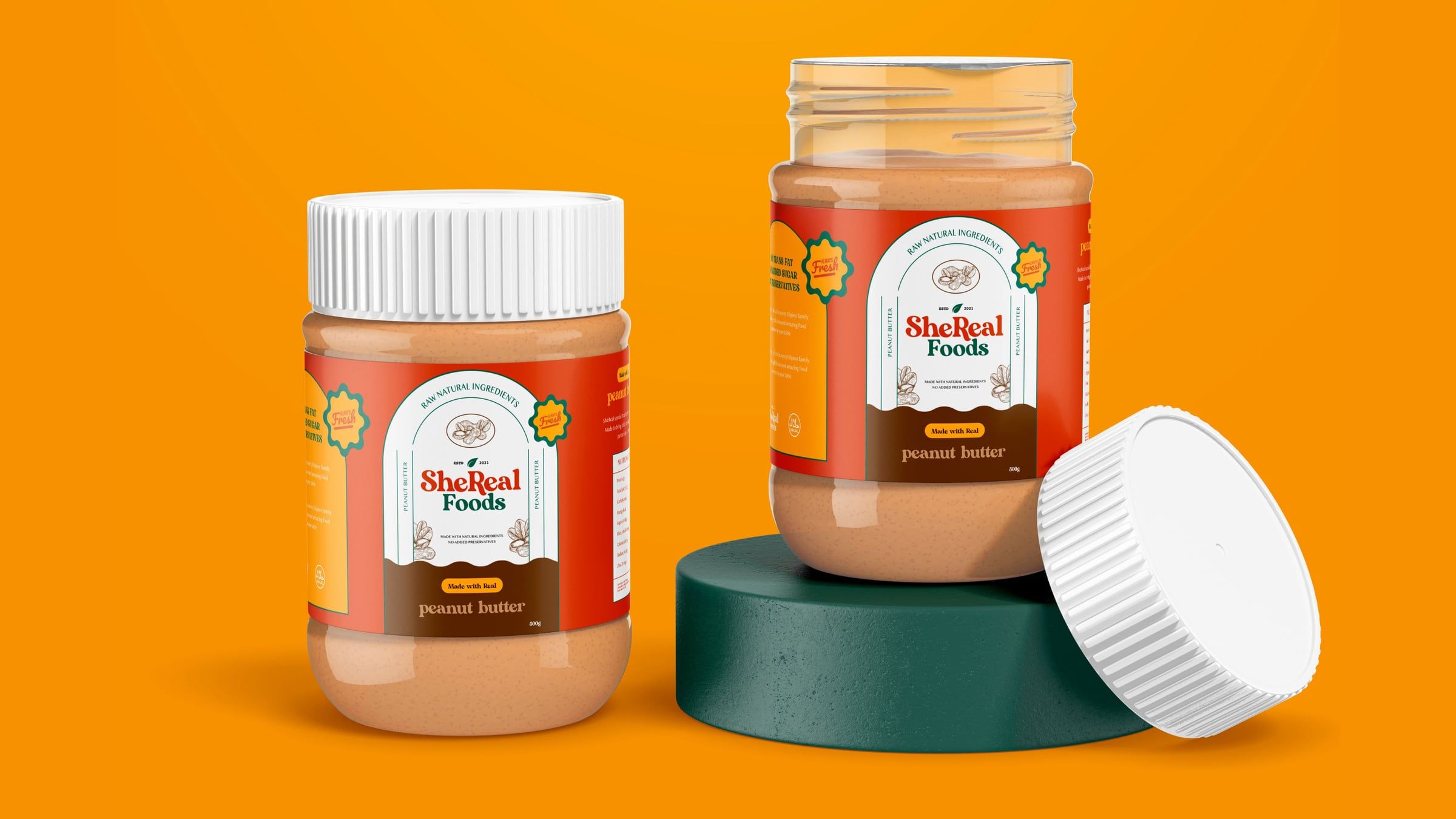
Two SheReal Foods peanut butter jars on an orange set

About the brand

SheReal prides itself on using natural and sustainable ingredients and has received positive feedback for the taste and quality of its peanut butter.

SheReal Foods logo, established 2021

The problem

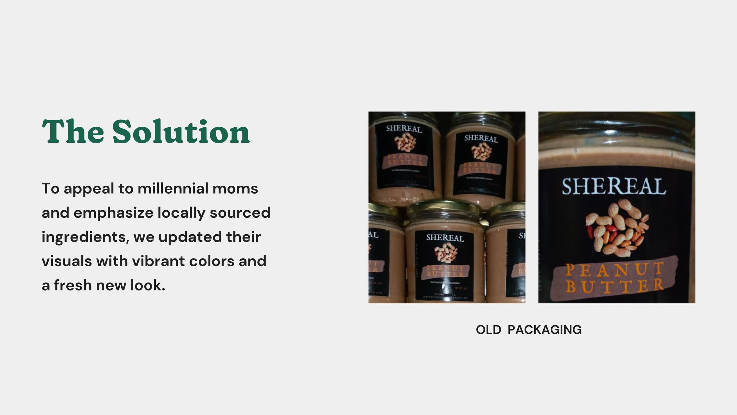
The brand was struggling to gain traction and increase sales. While the design was functional, it did not stand out on the shelves and did not communicate the brand's commitment to local and sustainable ingredients.
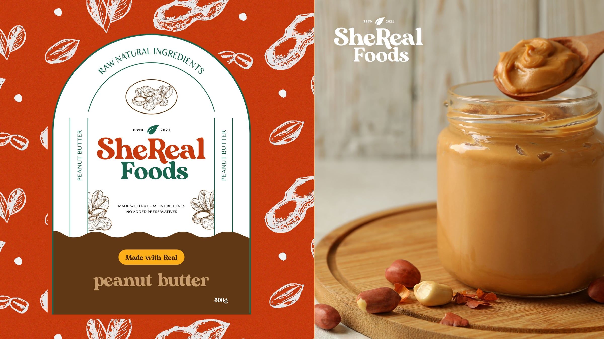
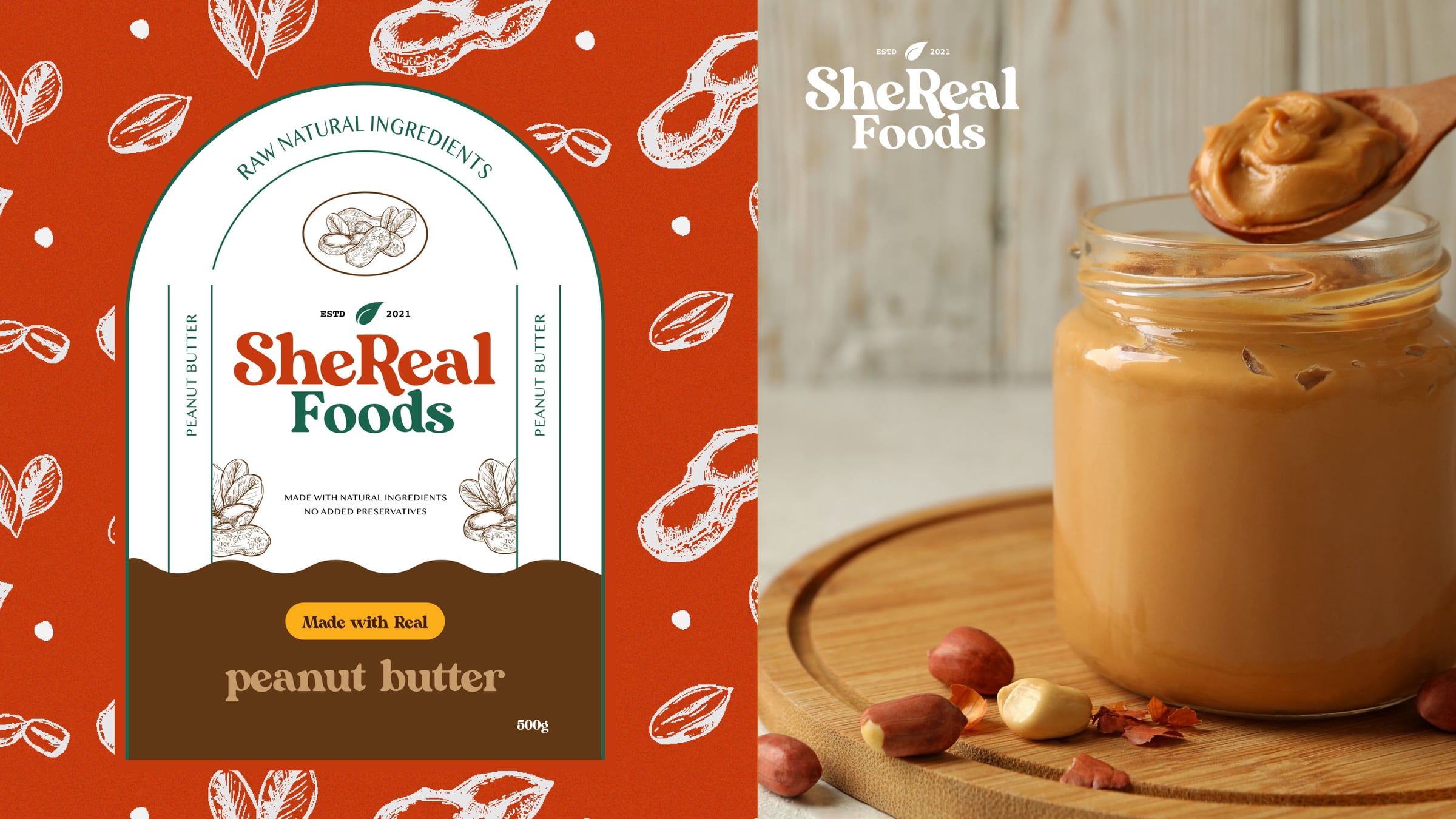
Label design next to a jar of peanut butter

The solution

To appeal to millennial moms and emphasize locally sourced ingredients, we updated their visuals with vibrant colors and a fresh new look.
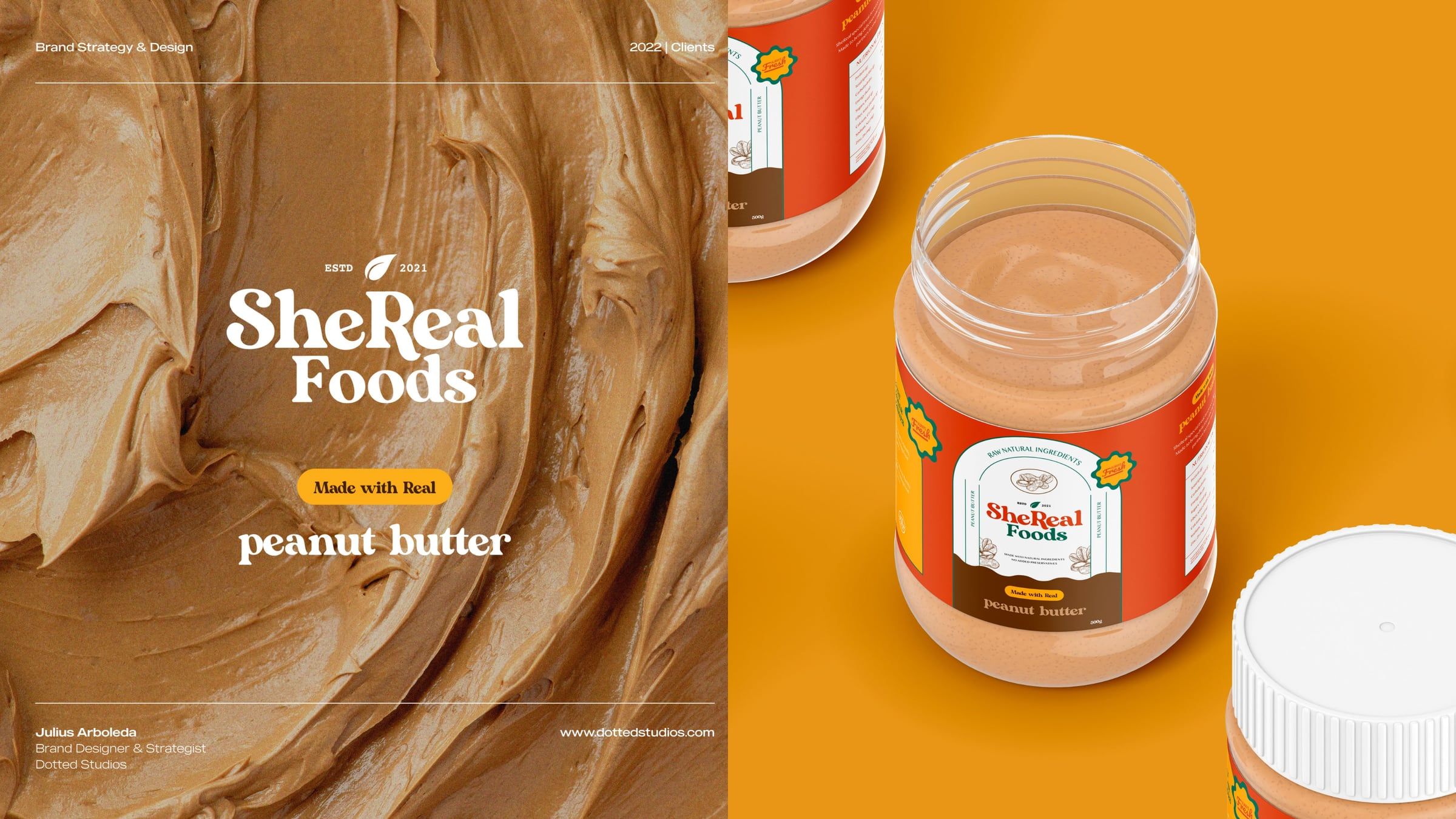
Peanut butter swirl with the logo

On the shelf

A warm retro wordmark, hand-drawn peanuts and a label that reads from across the aisle.
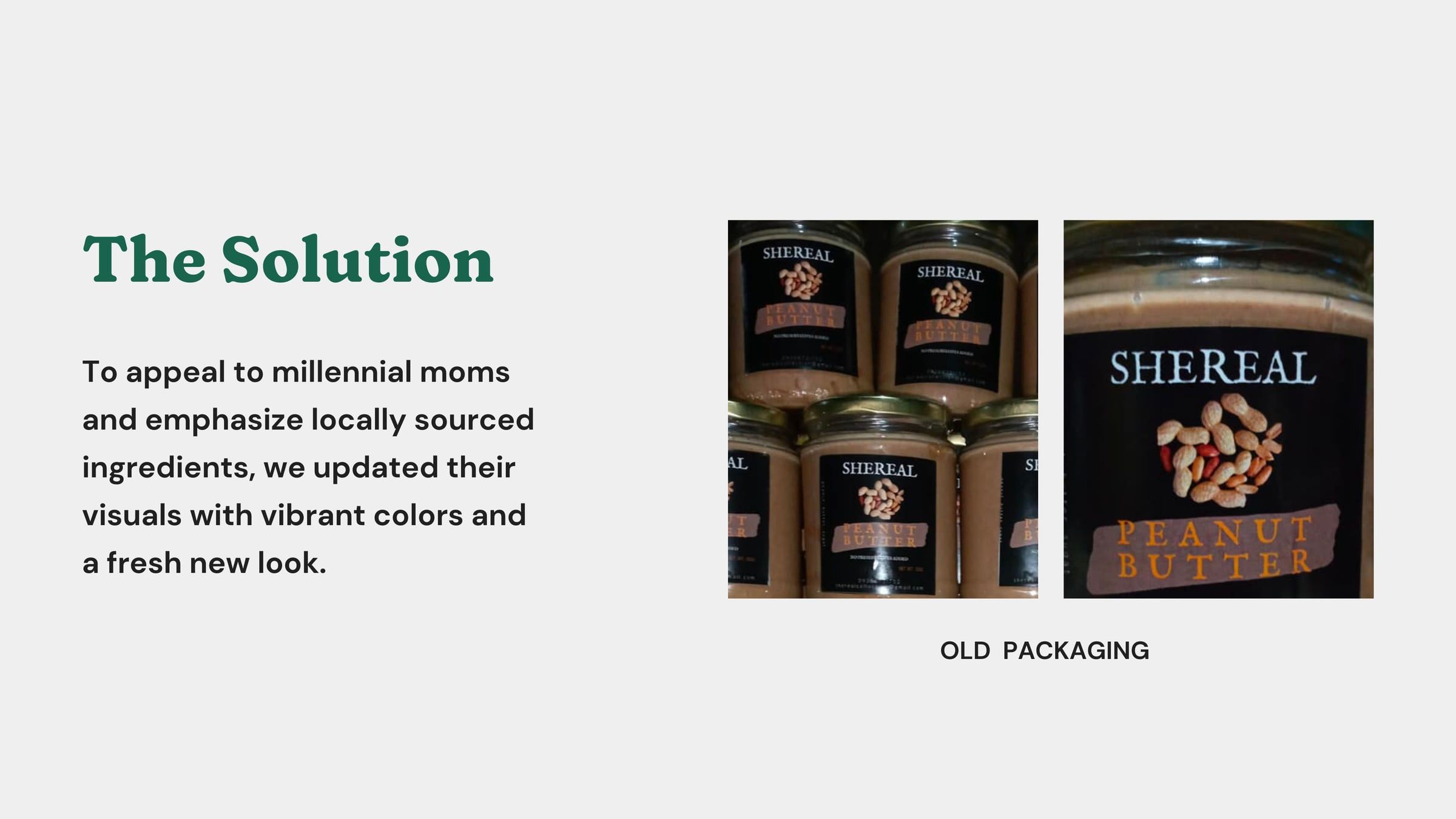
The solution slide with the old packaging
See it on Behance (opens in a new tab)
Next projectAlex & B Creative StudioIligan City · Branding