Every week a business owner tells us some version of the same thing: "Let's keep it simple, let's not scare anyone off." It sounds sensible. Nobody wants to lose customers over a logo.
But look at any street in Iligan. Five cafés in a row, all minimal, all beige, all with a thin sans-serif wordmark. Which one do you remember?
Safe brands blend in. Clear brands stand out.
Safe isn't neutral
A "safe" brand isn't a brand that offends no one. It's a brand that nobody notices. And a brand that nobody notices has to spend more on ads, discounts and promos just to be seen.
Clarity is cheaper. When people understand in two seconds who you are and who you're for, your sign, your cup and your feed start doing the selling.
What clarity looks like in practice
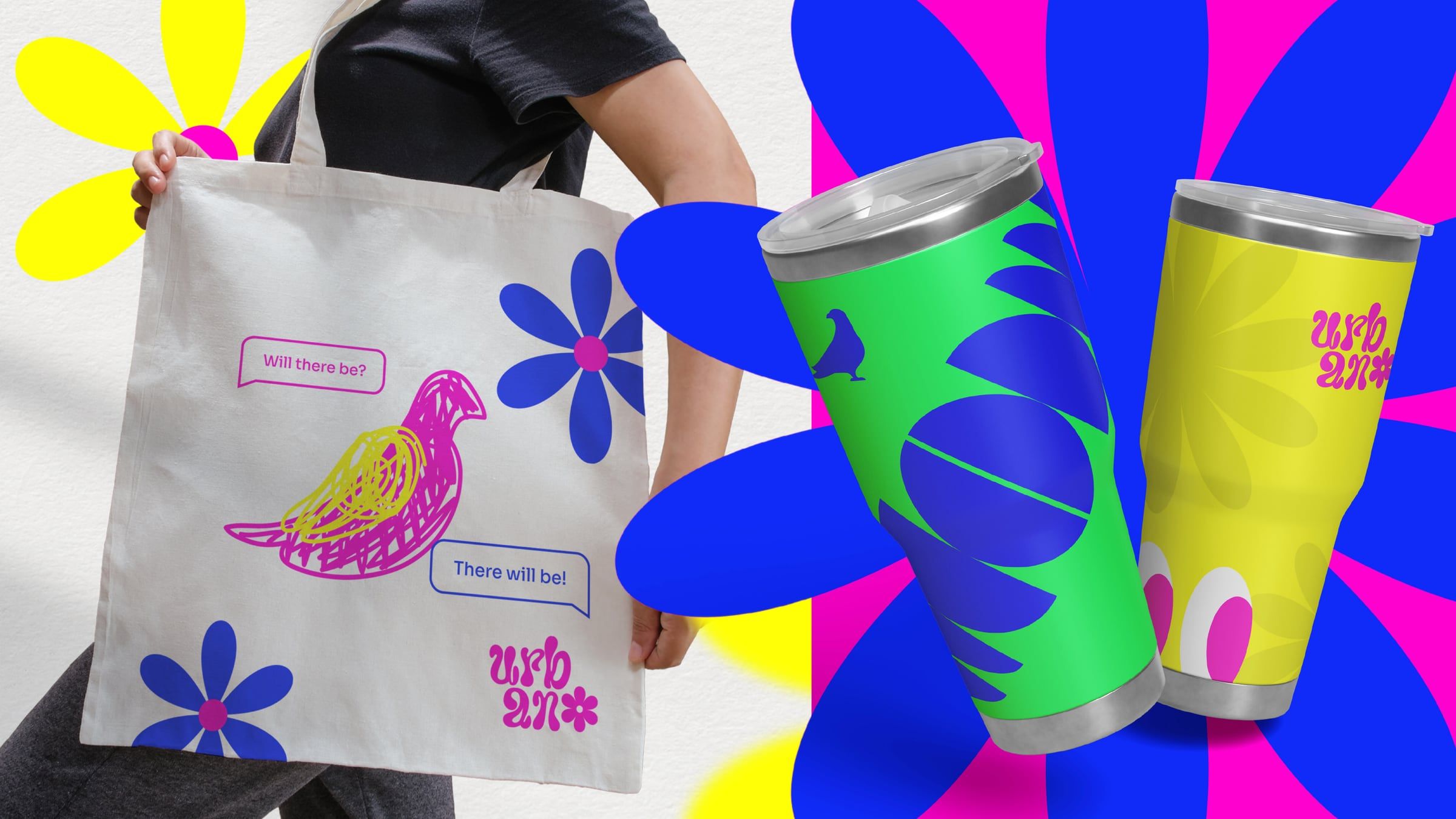
When Urban Coffee Studio came to us, the local café scene was stacked: industrial, minimal, Korean-inspired, carts, you name it. The safe move was another tasteful café. We went modern, funky and fun instead, because that's who the place actually is.
Three questions before your next design decision
- Would a stranger know what we stand for from this alone?
- Does this look like our competitors, or like us?
- If we removed the logo, would anyone still recognise it?
If the answers make you a little uncomfortable, good. That's usually where the brand starts.
Not sure where your brand is blending in?
Book a Discovery Call